Across the Mainland
[2020]
Across the Mainland explores the multiplicity of data at the intersection of representation and analysis. This hobby project animates domestic air travel over one 24-hour period, and uses the derivative data produced each frame to generate graphs of overhead flight schedules for all 423 U.S. Census-designated urban areas.
Animation depicting domestic mainland US flights on July 1, 2019; plane color corresponds to the dominant color of that airline's logo
Alternative visualization of domestic mainland US flights highlighting geographic relationships
Animated heat map depicting density of domestic mainland US flights; color ramp from purple to yellow to red
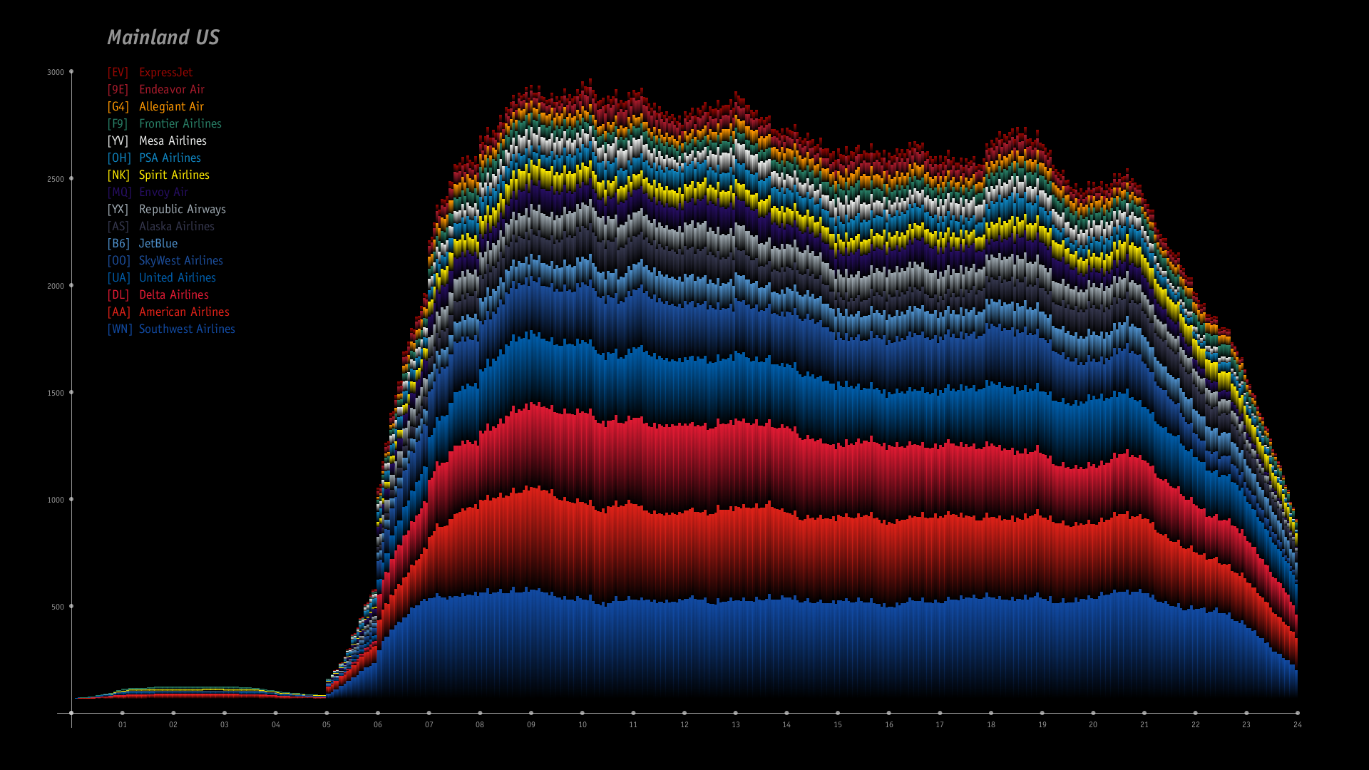
Mainland US air traffic volume per minute on July 1, 2019; organized by airline
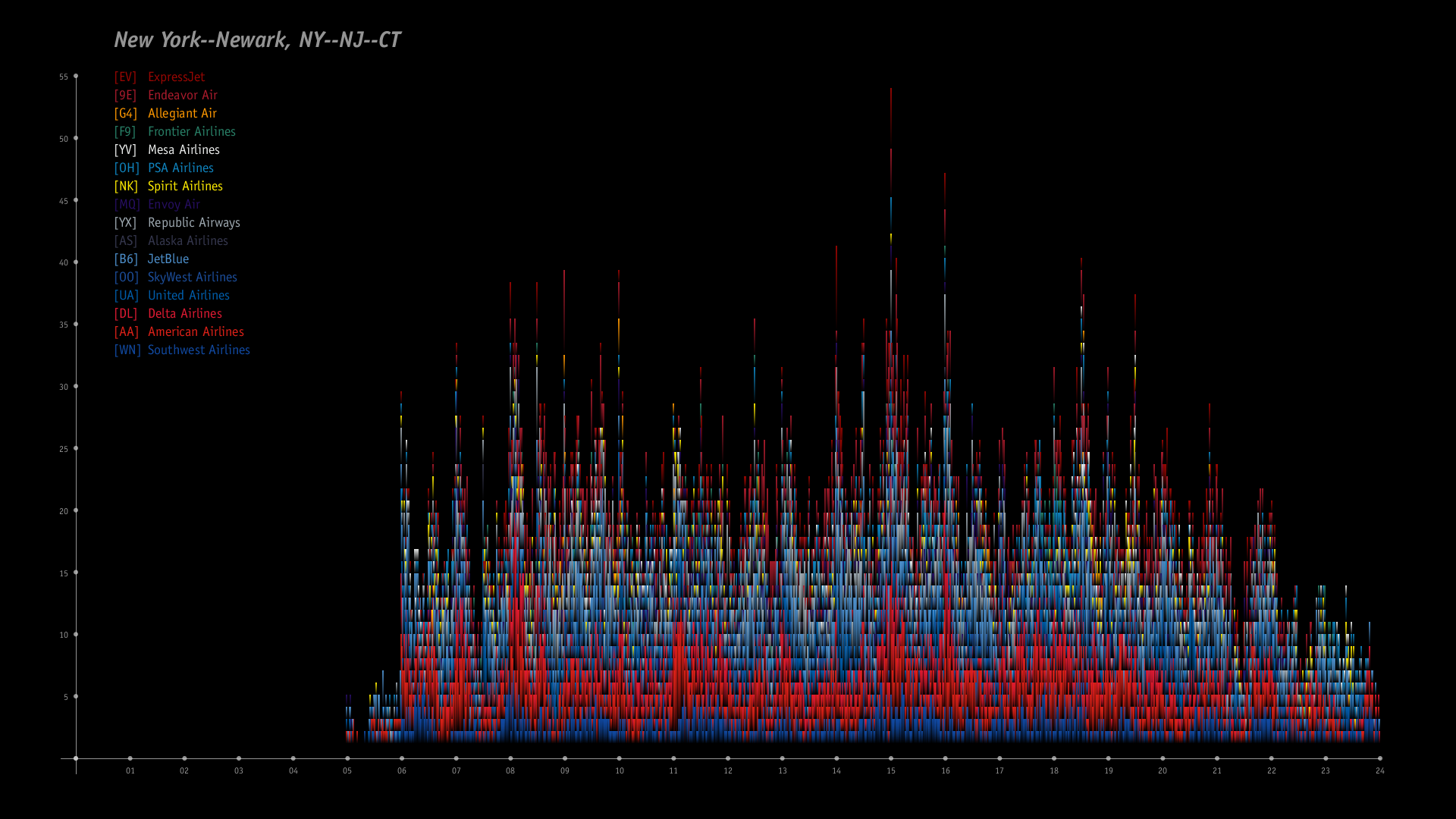
New York area air traffic volume per minute on July 1, 2019; organized by airline
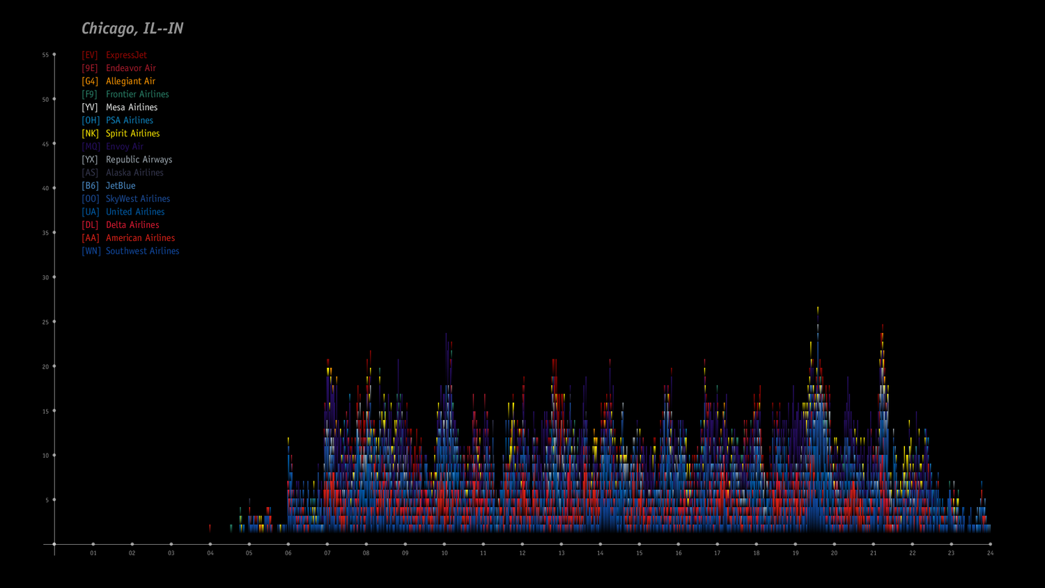
Chicago area air traffic volume per minute on July 1, 2019; organized by airline
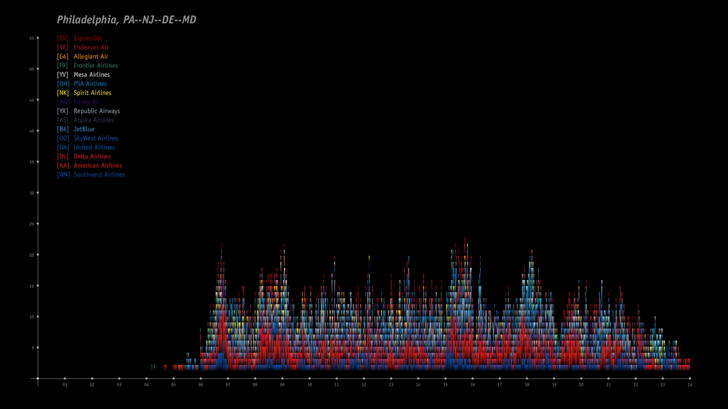
Phildelphia area air traffic volume per minute on July 1, 2019; organized by airline
Air traffic volume per minute for the top 9 urban areas; organized by population